Revamping a E-commerce Experience:

From a discount-led catalogue to a

vacation-lifestyle brand.

Revamping a E-commerce Experience:

From a discount-led catalogue to a

vacation-lifestyle brand.

Revamping a E-commerce Experience:

From a discount-led catalogue to a vacation-lifestyle brand.

A global swimwear platform with 4–6M monthly visits needed a brand reposition and UX overhaul to boost trust and conversions. Five screens, one cohesive journey, backed by data.

Purchase conversion rate

+32%
+32%

(2.5% → 3.3%)

Return rate

−7.5PT
−7.5PT

(38% → 30.5%)

Net kept orders

~+49%
~+49%

(combined uplift)

Snow Field
Snow Field
Snow Field

01 - overview

Aug 16, 2024

CUPSHE is a global swimwear and lifestyle fashion brand offering trendy, affordable vacation collections for women. The brand combines seasonal drops, diverse styles, and direct digital engagement to appeal to fashion‑forward shoppers worldwide.

Content

CUPSHE is a global swimwear and lifestyle fashion brand offering trendy, affordable vacation collections for women. The brand combines seasonal drops, diverse styles, and direct digital engagement to appeal to fashion‑forward shoppers worldwide.

Product type: E-commerce Website & Mobile Experience

Content

Domain: DTC Swimwear & Apparel

Content

Team: Product Designer (Me), 1 Delivery Lead, 2 Mid Senior designers

Content

Timeline: 4 Months

Content

02 - THE goals

Aug 16, 2024

Two mandates, one redesign.
Both had to win.
Two mandates, one redesign.
Both had to win.

MANDATE 01 - BRAND

Aug 16, 2024

Reposition from "fast-fashion swimwear at low prices" to "premium vacation-lifestyle brand" - without losing the conversion the catalogue model already produced.

Content

MANDATE 02 - UX

Aug 16, 2024

Fix the systemic usability and trust gaps surfaced by their own analytics & UX audit across the five screens that carry the journey: Homepage, PLP, PDP, Checkout, About Us.

Content

Users don’t just buy swimwear - they buy confidence in how they will look and feel.

When that confidence is missing, users hesitate, abandon, or return products.

Content

Users don’t just buy swimwear—they buy confidence in how they will look and feel. When that confidence is missing, users hesitate, abandon, or return products.

03 - discovery call

Aug 16, 2024

How we started
How we started

We aligned with the client to understand

what needed to change and why.

Content

01

Aug 16, 2024

Business context

Content


What Cupshe wanted to achieve through the redesign


02

Aug 16, 2024

Current experience gaps


Content


Where users were facing friction across the shopping journey


03

Aug 16, 2024

Brand & content strategy

Content


How the experience should communicate the new vacation-lifestyle positioning

Our FigJam board after discussion

Content

Our FigJam board after discussion

We synthesized the inputs to identify the key problems

The stats revealed a clear pattern: users were browsing, but not always

confident enough to buy.

Content

04 - RESEARCH AND INSIGHTS

Aug 16, 2024

The numbers had been on the dashboard for months.
They needed a designer to read them together.
The numbers had been on the dashboard for months.
They needed a designer to read them together.

signal 01

Aug 16, 2024

Behaviour gap between new & returning users

Content

4–6M

Monthly Visits

Content

Add to cart

New Users

Returning users

Intent is similar

Add to cart

14.2%

15.1%

Intent is similar

Checkout rate

4.2%

5.6%

25–30% gap appears here

Cart abandonment

70–74%

60–64%

10pt difference

Conversion rate

2.8–3.4%

4.4–5.1%

Returning convert ~50% better

Users were interested enough to add products, but new users were not confident enough to complete the purchase.

signal 02

Aug 16, 2024

Refund reasons -

Fit & Sizing Issues

Content

Reason

Core category

Trend

Intent is similar

"Item doesn't fit"

55%+

Stable, year over year

"Too small" (sub-reason)

5–6%(2024) → 7–8%(2025)

Fastest growing

Product/fabric concerns

30–35%

Stable

Other

10–15%

Stable

The product page was not helping users set the right expectations around fit, size, and fabric.

signal 03

Aug 16, 2024

Client provided

UX survey

Content

Screen

Top issues

Intent is similar

Homepage

"No clear story." "Looks like a sale, not a brand." Lack of inspiration or onboarding.

PLP

Confusing menu structure. No fit/style filters. Search returns irrelevant results.

PDP

Incomplete descriptions, missing fabric info, no fit guidance, too few/poor reviews.

Checkout

Promo code errors, surprise fees, forced login, missing payment methods.

Brand/About

"Don't know who this brand is." No story, no values, no faces.

The experience was not only visually weak; it was missing the trust and clarity users needed at each decision point.

05 - the plan

Aug 16, 2024

then we planned Roadmap

1

Aug 16, 2024

Research & Insights

Turn user behavior and data into clear design decisions.

2

Aug 16, 2024

UX Audit

Find what's broken before it breaks your conversions.

3

Aug 16, 2024

Competitor Analysis

Know where you stand. Design to lead.

4

Aug 16, 2024

Wireframe & Visual Redesign

Conversion-focused screens, built to ship.

5

Aug 16, 2024

Design System

One source of truth for every screen you build.

After synthesizing the research,

we audited key journey screens and studied competitors to identify what was breaking,

why it was happening, and how the experience could improve.

Content

There’s more inside these sections - use the <- -> arrows to explore the full story.

Content

06 - ux audit

Aug 16, 2024

key journey screens audited

The audit helped us identify the exact moments where users were losing clarity, trust, and confidence,
which gave us a sharper direction for competitor analysis and redesign.

Content

The audit helped us identify the exact moments where users were losing clarity, trust, and confidence,
which gave us a sharper direction for competitor analysis and redesign.

07 - the market

Aug 16, 2024

Competitor Analysis
Competitor Analysis

08 — Core Strategies

Aug 16, 2024

Three pillars.
Brand + UX Aligned
Three pillars.
Brand + UX Aligned

Pillar 01

Aug 16, 2024

Lead with the vacation, not the discount.

Content


  • Editorial hero with seasonal lifestyle campaigns

  • "Shop by occasion" navigation alongside category

  • UGC and influencer rails as social proof, not decoration


Pillar 02

Aug 16, 2024

Resolve fit at the moment of decision.

Content


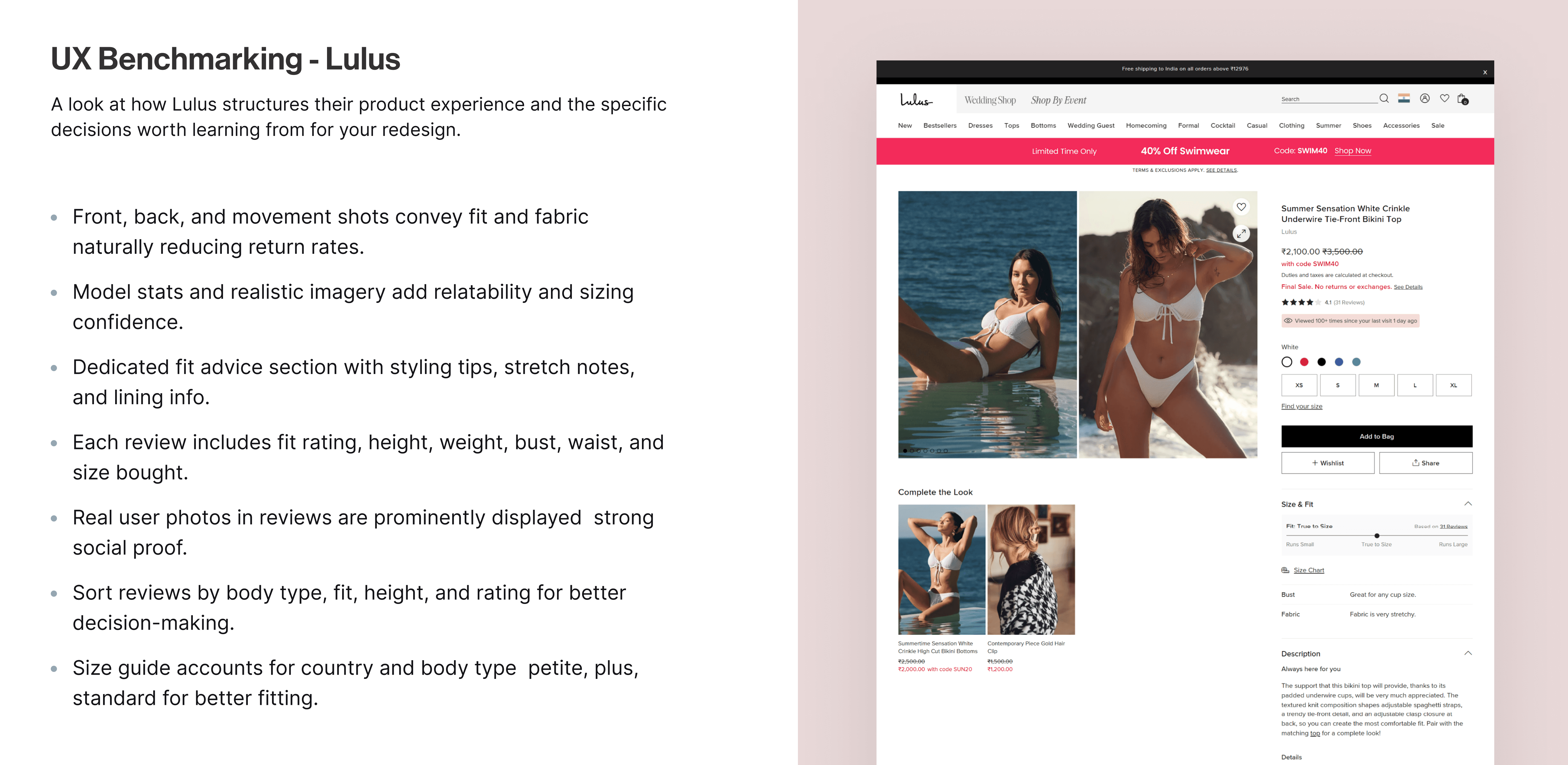
  • Fit meter at the top of the variant selector

  • "Recommended for you" size based on prior kept orders

  • Fabric shown in closeup for quick decision making


Pillar 03

Aug 16, 2024

Make the brand feel like it has a soul.

Content


  • About Us rebuilt as a brand-story page, not a corporate page

  • Checkout: guest flow, clear pricing, no surprise fees

  • Consistent brand voice across all five screens


Wireframes, Iterations & Figma Nights…

Content

Before moving into final UI, we explored multiple wireframe directions and refined each screen

through feedback, layout experiments, and design reviews.

Content

A few ideas looked great at midnight and questionable in the morning - but every iteration helped us

simplify the journey before polishing the visuals.

Content

09 — final output

Aug 16, 2024

The Redesign. screen by screen
  1. Homepage - set the tone before you sell.

Content

  1. Navigation mega menu - to efficiently browse categories.

Content

  1. Product list page - help her browse without burning out.

Content

  1. Product detail page - resolve fit, on the page.

Content

  1. Checkout — don't break trust at the finish line.

Content

10 - Design Foundation

Aug 16, 2024

Scalable Design Sytem

Behind the polished screens was a large design system - simplified into reusable components, consistent patterns,

and clear handoff guidelines to keep implementation smooth.

Content

Behind the polished screens was a large design system - simplified into reusable components, consistent patterns,

and clear handoff guidelines to keep implementation smooth.

11 - impact

Aug 16, 2024

Results
Results

Compared before and after PDP versions to measure impact on visitors, conversion rate, and returns.

Content

4-week A/B test with a 50:50 traffic split across desktop and mobile users, comparing the existing PDP experience with a variant focused on fit clarity, size guidance, and expectation-setting at the point of decision.

Purchase conversion rate

+32%
+32%

(2.5% → 3.3%)

Return rate

−7.5PT
−7.5PT

(38% → 30.5%)

Net kept orders

~+49%
~+49%

(combined uplift)

next casestudy

next casestudy

nEXT
CASESTUDY

My creative spirit comes alive in the digital realm. With nimble fingers flying across the device.

Let's create
Incredible work together.

dIVYESH

Let's create
Incredible work together.

dIVYESH

Let's create
Incredible work together.

dIVYESH

Let's create
Incredible work together.

dIVYESH

Create a free website with Framer, the website builder loved by startups, designers and agencies.